
Sansotei
ramen

DURATION.
NOV 2024 – DEC 2024
TOOLS.
Wix | Figma | Illustrator | Photoshop | Excel

TOKUTSU RAMEN
TOKUTSU RAMEN
BACKGROUND.
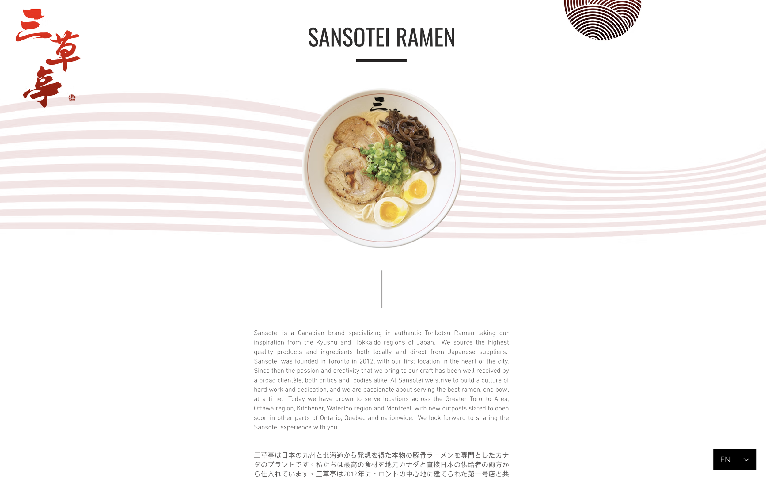
Sansotei Ramen is a Canadian brand specializing in authentic Tonkotsu Ramen. It located across the Greater Toronto Area, Ottawa region, Kitchener, Waterloo region and Montreal. The project aims to redesign the website the give it a modern look and Japanese vibe and requires restructuring the map of locations.
MY ROLE.
UX/UI Designer: I redesigned Sansotei Ramen's website and created templates and a visual guide to establish consistency across each page and a cohesive brand identity. Deliverables include 5 hight fidelity screens, each adapted for at least 3 breakpoints, typographic styles, color palette, and templates with precise layout and spacing guidelines.
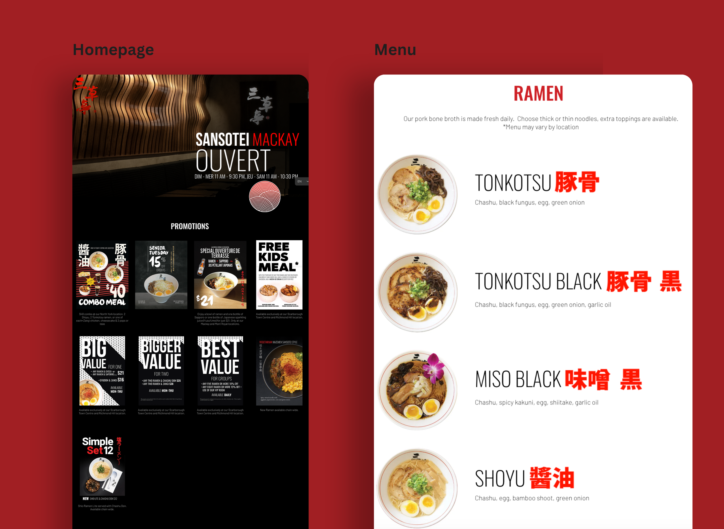
I redesigned 4 of the main screens for the Sansotei Ramen. The pages included Home, Menu, Media and Locations. The insights showed that the current site in brand identity is not strong enough to leave a lasting impression on customers.
previous website Layout

Issues
The brand image such as color, style and layout are inconsistent.
The Homepage cannot show the product in the area of the company's focus
Some of the content is redundant, outdated, or trivial on the site.
HomePage
Combining distinctive visual and navigational signposts help users recognize and recall the homepage. It allows users to recognize the navigation easily.

Online order
The online order system is one of the main revenue stream for restaurant. Therefore,it is selected on the homepage.
About
According to let user recognize ramen is the main item in their business, I added a ramen image and their identity wave on the back.
Header


The header is changed to the side menu and the hero in homepage.
Overview.
The process was recurring every week.
STEP 1
Meeting
We held a Zoom meeting with the clients to identify the needs of the next content.
STEP 2
Site Guideline
We received a site guideline for each tailored to meet unique needs.
STEP 3
Wireframing
We made the wireframes to the programmer and designer to ensure the page content and functionality were positioned correctly.
STEP 4
Production
I inspected all the image sizes and details. We ensure the content is correct before the programmer produces the interface by HTML/CSS.
STEP 5
Testing
TestingWe produced the test page and sent it to the client. They would get a comment back to us the next day.
Step 6
Revising
We conducted the revision based on their comments to create the 2nd test page or 3rd test page.
Step 7
Produce APP
I proofread the content was synced between the interface of PC & H5. After that, I would produce the APP interface.
Step 8
Launch Site
We used some tools that tested across a bunch of pages before publishing.

E-newsletter
Identify where images, CTAs. When planning the design, we considered the visual hierarchy. Place the most important content at the top and use headings, subheadings, and images to break up text.